When I think about America, my head flurries with images, feelings, and history. As these blips of culture phase in and out of focus, I begin to realize that there is simply too much information. From regional delicacies to tourist traps, America itself is unique, everchanging, and yet, somehow still rooted in the past. There’s just something about the “Land of the Free” that many deem to be special. Unlike many of my peers and fellow American citizens, I’ve never made a trip abroad. No summer vacations in the islands, no spring break trip to Mexico, and no semesters spent in Europe. While I do lament the fact that I’ve been somewhat deprived, I can consider myself to be an expert in “USA today.” This week, I worked to simplify my home country into a singular concept: Regional Stereotypes.
If you’ve lived in America for any period of time, you’d know that while we are a hodgepodge accumulation of culture, beliefs, and practices, there is an overwhelming need to simplify groups and regions into digestible chunks. These digestible chunks take the form of stereotypes. While sometimes crass and somewhat inaccurate, regional stereotypes help us make the vast land of America seem a bit smaller.
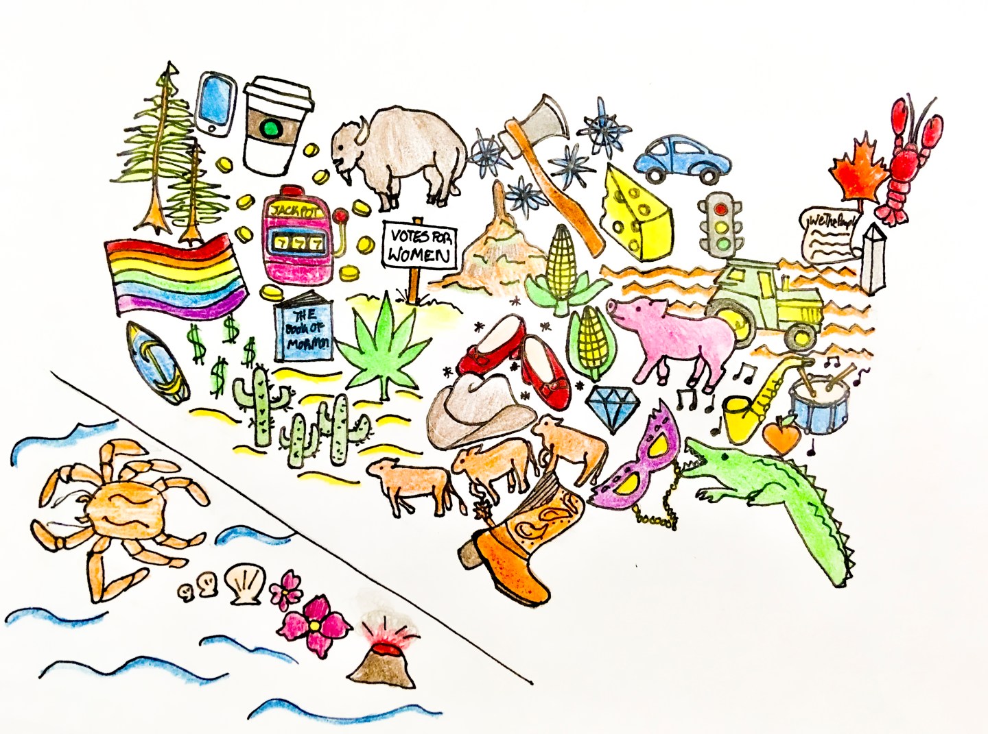
After definitely choosing regional stereotypes as my concept, I called upon all of those cultural blips in my brain to guide my creative process. The easiest way to begin was to start depicting the regions with the most stereotypes first. This led me to the creation of my Florida gator, the cowboy home of Texas, the historically-valuable documents of Pennslyvania, and the colorful characteristics of California. With those states accounted for, I was able to frame America from four points. Although not every state is represented within my illustration, the symbols I have used to classify that region do enough to help the viewer contextualize where they are looking at and what that stereotype is.
For example, when one looks towards the northwest, one can see the icons of a cell phone and a coffee cup. Washington state is notoriously known for its coffee and tech scenes, with many global companies like Starbucks, Amazon, and Microsoft calling this place home. In other areas of my drawing, the stereotypes begin to be a little bit more abstract. In Minnesota’s general location, I depicted an axe. This harkens to several different cultural ties. The first being the folklore stories of the giant lumberjack, Paul Bunyan. The second cultural tie is Minnesota’s football team, the Vikings. To really help the viewer grasp that this area is Minnesota, snowflakes were added to harken to the area’s frigid weather.
While creating this drawing, I was careful not to use any signs or names that might tip off the viewer about states, cities, etc. I could have easily used the Las Vegas sign to demonstrate Nevada – but it wouldn’t have fit the theme of stereotypes because it would just be referencing that one singular place. Instead, the slot machine and coins did well to get that point across while feeding into other regional stereotypes like Native American-owned casinos, gambling problems, and the greed of the West (think about the gold rush).
After looking at my final product, I think that it is a well-balanced mix of obvious and subtle cues. The organization of all the elements mimics the shape of a map of America without including the dead giveaway of outlining its iconic shape. The distribution of bright colors helps balance the piece and allows the eye to travel through it without too much difficulty. As a whole concept, I am very curious to see if this concept is easily identified by new viewers. Some of the symbols used can easily be mistaken for a category like agriculture/industry or tourism spots. Hopefully, there are just enough cues that push stereotypes as my inspiration to the forefront. I cannot wait to see the results of this test next week.

Nice work Alex, it seems that you and I had similar ideas of how to present our data! I look forward to reviewing it on a deeper level and learning why you chose the images you chose. Also you are a great artist. I wish I was a skilled artist.
LikeLiked by 1 person
Hi Ashley, thank you for the feedback. I got into this class a *bit* late so I apologize if there is some weirdness regarding timing of the assignments. More to come! 🙂
LikeLike
Hi Alex,
Impressive concept and nice illustration! With only a quick look, I can tell this a story or map of America and what geographical regions are known for. I like that you mixed geographical landmarks, monuments, animals, music, food, industries and products. It’s a nice snapshot of what makes America unique.
All of your elements fit together and transition from one to the next smoothly creating a strong visual. I like the alligator tail for Florida and the cowboy boot for Texas. You’ve included a maple leaf for the Northeast, Georgia peaches, Mardi Gras, Las Vegas slot machines, cheese for Wisconsin, Starbucks coffee cup, Redwoods and a volcano in Hawaii, to name a few.
My only critique is Hollywood isn’t represented (apart from ruby red slippers in Kansas). I don’t know if you could have included a movie camera or the Hollywood sign in southern California—it might add something.
It’s a good example of Gestalt’s principle of simplicity—our minds form the map: the illustrations compose the map. In addition to the principle of simplicity, the map is also formed by Gestalt’s principles of proximity and similarity. The illustrations are similar in style and located near each other, so we instinctively group them together. The principle of continuation is also at work—we perceive the map as a single image because the lines formed by the edges the individual illustrations lead to each other, and we extend lines and thus form the outline of the map.
Your map has a friendly feel. The cartoonish style, coupled with bright colors, makes your illustrations friendly and inviting—we naturally equate bright colors with happiness. The friendliness is further enhanced by the roundness for the drawings—round elements are perceived as fun.
This was a pleasure to look at. Great job!
LikeLike
Hi Michael,
Thank you for the very thorough review of this piece. I’m glad you enjoyed it! 🙂
– Alex
LikeLike