
In the early 2000s, I remember sitting in my 4th-period health class listening to the teacher drone on about nutrition, exercise and what would happen if you did drugs or alcohol. The framing of all of this information was exceedingly mind-numbing and as a 10-year-old, I didn’t care to pay attention to it longer than I had to. One week stood out to me in particular though. When we were going over the topic of obesity and nutrition, I remember my teacher wheeling in a television and a DVD player on one of those carts. Excited for what I thought might be a Disney movie, I perked up. She inserted the disc and that was when I watched one of the most disgusting and eye-opening videos I had ever seen.
Morgan Spurlock’s docu-film Super Size Me was a massive phenomenon that exposed the dangers of eating processed fast-food. Obesity then became a huge discussion point in schools and on the news, with health professionals trying to explain what foods were “dangerous” and how people with certain medical history – or were taking certain medications – could be predisposed to this condition. Nobody actively wants to be unhealthy, but with sensitivity regarding this topic, scientists, healthcare professionals, and the media have had to be clever with reporting data. To communicate this information, visual storytelling devices were integrated with this data in order to deliver the “real experience/truth” without alienating or humiliating the group in question.
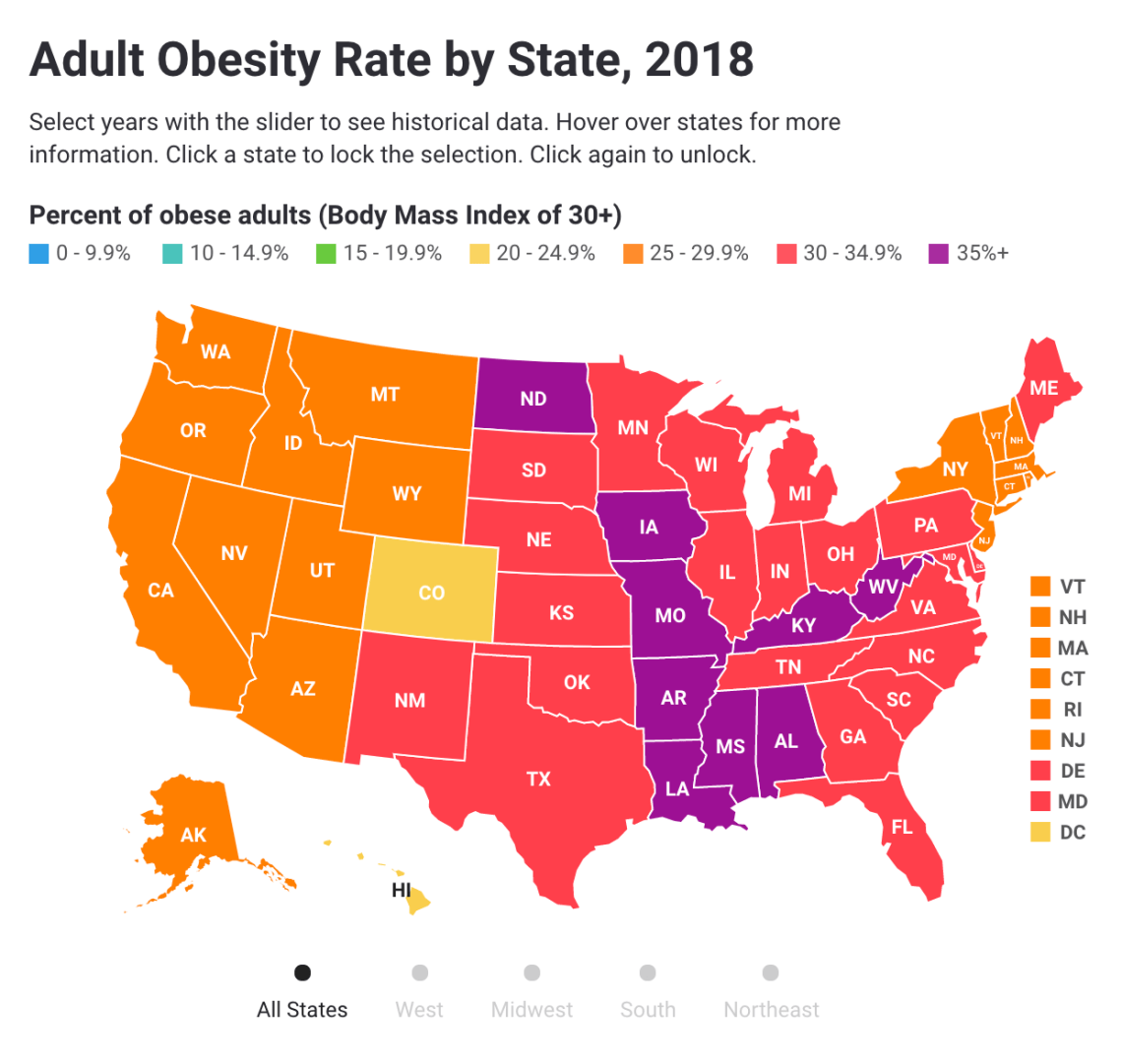
According to The State of Obesity, the adult obesity rate has increased in 7 states just in this past year alone. These states’ obese population hovers between 25-35% of their inhabitants. As a force in spreading awareness about the impact of obesity, The State of Obesity has dedicated an impressive amount of their website towards reporting the latest scientific studies & surveys and educating about the subject. While there is a long history of visual communications in science, it hasn’t been until recently that organizations have been producing data for the everyday person. On this page on The State of Obesity’s website, they do something quite interesting. To assist in the general education of American citizens, they have created an interactive map where viewers can select various parts of the country, compare them to other states, and click through to get a detailed look at how this critical disease is affecting their home state. What makes this interactive visualization so easy to understand is its use of color. By playing off of the innate link between colors and emotions, they are able to create a sense of urgency about the topic and which places are the most highly affected.
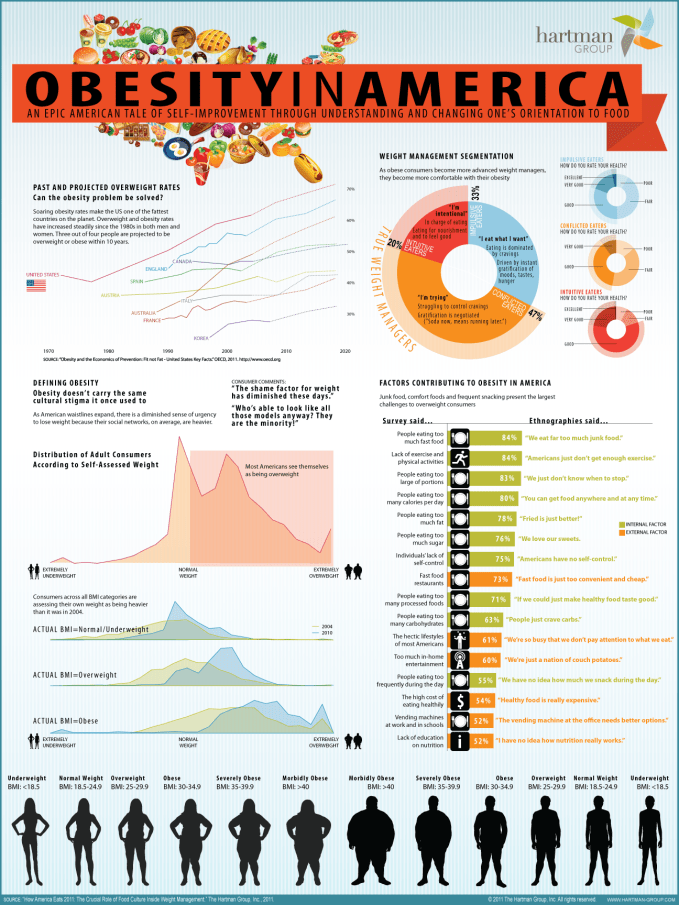
Just like people have the innate ability to distinguish important information using visual cues, they also have the innate ability to be retrospective in order to find the roots of problems. In this highly detailed infographic from the Hartman Group, the source issues of obesity are explored. While 90% of the information the eye absorbs is lost by the time it reaches the brain, this visual example does a great job with affirming the 10% of absorbed knowledge by accompanying it through the usage of detailed captions and labels. Again, the great application of color helps to draw the viewer in and stimulate an emotional response.
According to this graphic, there are several factors that lead to the increased obesity in adults. The first is a sedentary lifestyle, and the second is that the majority of the population are impulsive or conflicted eaters. This means that many tend to eat what they want or they try to create their own system in which they try to manage cravings. In some cases, people use food to cope. This lack of self-control leads to a binge on carbohydrates and sugar, which over time contributes to the development of health issues like obesity.
While a lack of self-control and a sedentary lifestyle can contribute to weight gain, there is another aspect that can also lead to obesity. Economic status is one of the largest reasons why our country has such a high rate of obesity. With many of the “fattest” states being in the more impoverished states (West Virginia, Lousiana, Alabama, & Missippi), we cannot ignore the fact that people who do not have access to healthy food are less likely to maintain a healthy body weight. Economic status is, unfortunately, often linked to ethnicity. Due to our country’s past with slavery, racism, and sexism, minority groups are more likely to experience multidimensional poverty than their Caucasian neighbors.
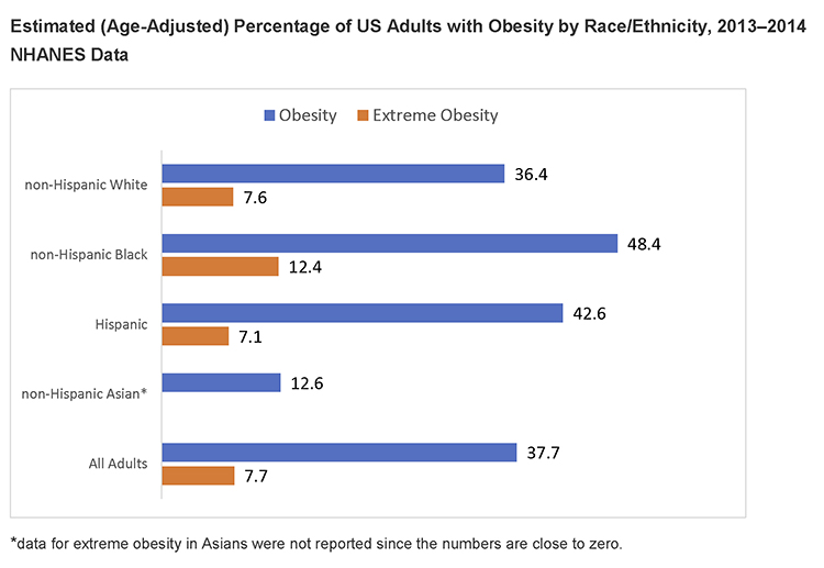
While this visual on The National Institute of Diabetes and Digestive and Kidney Diseases’ website is extremely straightforward, the clean bar graph elements and contrasting colors make the information easy to absorb and non-threatening.
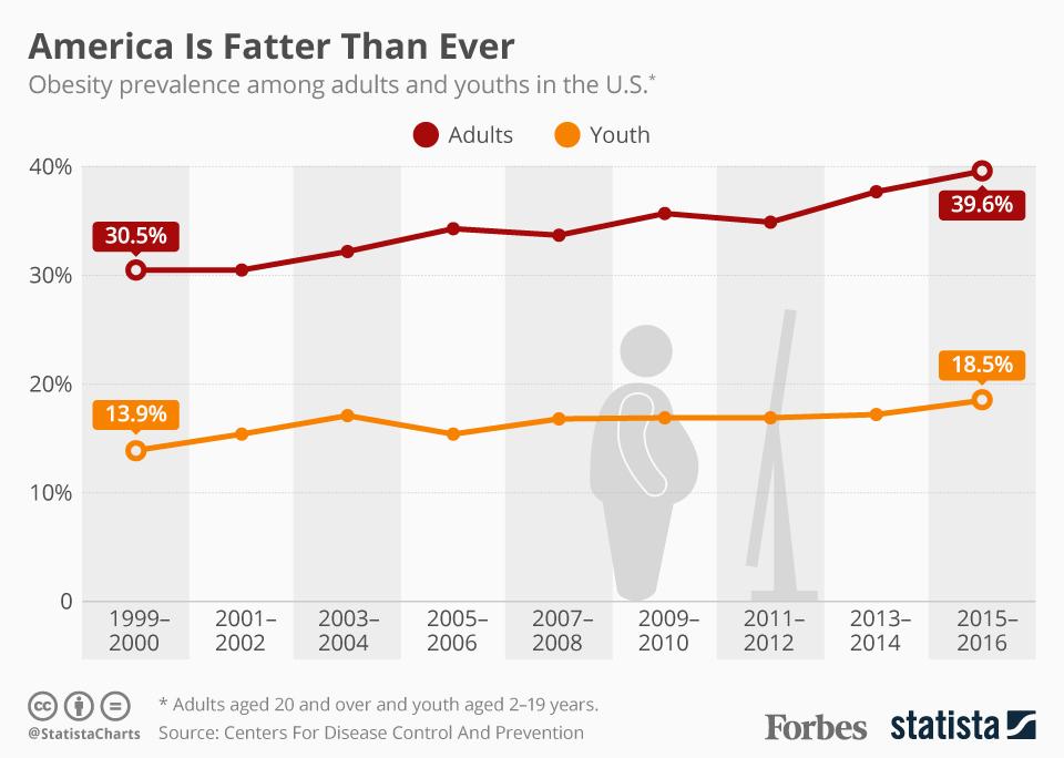
This principle of simplicity can also be seen on the above line graph from a Forbes and Statista collaboration. While it isn’t as visually stimulating as the Hartman Group’s infographic or The State of Obesity’s interactive map, it does have a lot of great minimalistic touches that help viewers retain the information. The first thing I’d like to call out is the vertical white and gray bars that separate the periods of time visually. This emphasizes the time period in which each point is living in and visually guides the eye to the next point. The second thing it does really well is integrating iconography into the graph so that you can understand what it is about without having to read the headline. The vector graphic serves as an impartial way to display the issue they are discussing without being derogatory.
Lastly, if all else fails, videos are one of the best ways to tell a visual story. In this clip from the Infographics Show, they display a bunch of information similar to that of the visuals above in a way that is interactive, engaging and memorable – just like how I remember all of the nasty details from the Super Size Me film. The Infographics Show’s animation does well to highlight certain pieces of information over others and the grouped, infographic-style visuals present something that is fun yet professional. The voice-over also contributes to information retention and emotional connection. By having someone actually talking and telling the story, we are more likely to stay present and recall it later. Through this method of storytelling, audiences of all backgrounds can appreciate the content and how obesity is affecting our country.
The Bigger Picture
After viewing all of these pieces regarding the same subject, I have to admit that there is a secret sauce when it comes to creating visualizations that are as stunning as they are effective in communicating the story at hand. In their research paper, “Scientific Storytelling using Visualization,” the authors reveal a three-step guide:
- Know your audience: See how much they know and how familiar they are with data visualizations. Presenting something they don’t connect to or understand will alienate them.
- Set the stage: Make sure your audience has enough background information about that dataset so that they can make sense of your visualization. Here is where you will need to formulate the bulk of your story.
- Make it relevant: Leave the audience with a lasting impression. Do everything you can to make sure they understand how the story is relevant to them and its greater implications.
I hope you remember these three steps the next time you are tasked with serving an audience with a hearty data meal. If you have learned anything from this post, let me know in the comments below. I look forward to hearing from you.
Sources:
(n.d.). Retrieved from https://www.apa.org/pi/ses/resources/publications/minorities.
Alton, L. (2018, October 1). How the Travel Industry Is Using Visual Storytelling to Bring Its Economic Impact into Clear View. Retrieved from https://www.skyword.com/contentstandard/creativity/how-the-travel-industry-is-using-visual-storytelling-to-bring-its-economic-impact-into-clear-view/.
Busche, L. (2019, May 15). Simplicity, symmetry and more: Gestalt theory and the design principles it gave birth to. Retrieved from http://www.canva.com/learn/gestalt-theory/.
Cao, J. (2018, June 11). Web design color theory: how to create the right emotions with color in web design. Retrieved from https://thenextweb.com/dd/2015/04/07/how-to-create-the-right-emotions-with-color-in-web-design/.
Estrada, F. C. R., & Davis, L. S. (2014). Improving Visual Communication of Science Through the Incorporation of Graphic Design Theories and Practices Into Science Communication. Science Communication, 37(1), 140–148. https://www.researchgate.net/publication/271516036_Improving_Visual_Communication_of_Science_Through_the_Incorporation_of_Graphic_Design_Theories_and_Practices_Into_Science_Communication. doi: 10.1177/1075547014562914
Ma, K.-L., Liao, I., Frazier, J., Hauser, H., & Kostis, H.-N. (2012). Scientific Storytelling Using Visualization. IEEE Computer Graphics and Applications, 32(1), 12–19. http://vis.cs.ucdavis.edu/papers/Scientific_Storytelling_CGA.pdf. doi: 10.1109/mcg.2012.24
McCarthy, N. (2017, October 16). U.S. Obesity Rates Have Hit An All-Time High [Infographic]. Retrieved from https://www.forbes.com/sites/niallmccarthy/2017/10/16/u-s-obesity-rates-have-hit-an-all-time-high-infographic/#55f9da384bad.
Mcleod, S. (n.d.). Visual Perception Theory. Retrieved from http://www.simplypsychology.org/perception-theories.html.
Obesity in America. (n.d.). Retrieved from https://visual.ly/community/infographic/health/obesity-america-1.
Overweight & Obesity Statistics. (2017, August 1). Retrieved from https://www.niddk.nih.gov/health-information/health-statistics/overweight-obesity.
Show, T. I. (2015, January 5). Retrieved October 7, 2019, from https://www.youtube.com/watch?v=IkoC3HZwe7Q.
