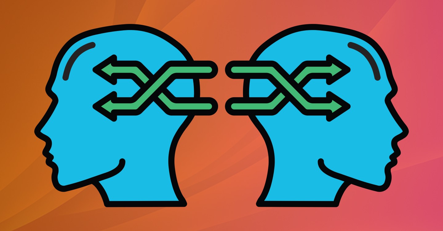
Streamlined, intuitive, functional, responsive. All of these words have been massively overused to describe websites – but how did they even become the preferred descriptors of “good” web design? As our lives become more entrenched in the digital sphere, the way we interact – and want to interact – with technology changes. In order to let users seamlessly manage their online activity and subliminally guide them through the preferred customer journey, designers implement UX/UI. If you’re familiar with the design space, you’ve probably heard of these two abbreviations before. In case you’re completely new, let’s break it down.
“UI is the saddle, the stirrups, & the reins. UX is the feeling you get being able to ride the horse.”
– Dain Miller
UX design, or user experience design, is a human-first way of designing products. This process aims to enhance customer satisfaction by improving usability – be it through design, function, or product integration. UX design is unique in the fact that it encompasses any and all interactions of a potential or active customer and a company, its services, and its products, regardless of its medium. UX is found through a mobile app as well as in a brick and mortar store – think about a popular chain restaurant you frequent. Regardless of the location or medium, the interaction you have with that restaurant is pretty consistent – this is a simple example of how you come into contact with user experience design every day.
UI design, or user interface design, is the process of making interfaces in software or computerized devices with a focus on looks, style, and ease of use. Here, designers strive to create interfaces that will create delight through highly usable and efficient controls and layouts. These could be conventional graphical interfaces but can also include others, like the growing voice-controlled ones such as Amazon’s Echo, Apple’s Siri, or Google’s Dot virtual personal assistants. UI pairs with UX because it is the backbone of how a customer interacts and experiences a company or brand. Together, the two design focuses create insanely cool experiences that simplify customer interactions and guide them to encounter businesses in their preferred (i.e. strategically created) way.
Let’s Get the Brain Involved
To understand exactly why UX/UI works, we must first try to understand what drives users to certain behaviors. If you take the time to observe the user experience you have on various sites or apps you frequent, you might notice that there are a lot of patterns. These popular design features, like an endless scroll, pull to refresh, or liking/sharing a post have transcended social media and made their way into various online experiences. Due to these “predictable” design features, we have been able to design interfaces that are intuitive.
“A design is intuitive when people just know what to do and they don’t have to go through any training to get there… When a design is not intuitive, our attention moves away from what we’re trying to accomplish to how we can get the interface to accomplish what we want.”
– Jared Spool
How can designs possibly be intuitive? The answer to that is psychology. The human brain is considered to be one of the greatest mysteries, however, centuries of studies have shown that it is possible to understand the process of initiating and performing a behavior. Think of this as how a brand can entice a person to purchase a product or get many people to subscribe to their email newsletter. We can begin by distinguishing between intrinsic and extrinsic motivation.
Intrinsic motivation is when a behavior is motivated by your own internal desire to do so. Think of this as organizing your desk because it helps you feel more put together and professional, or baking a bunch of cookies because it helps you relieve stress. Extrinsic motivation is when your behavior is motivated by an external factor in the hopes of earning an award. This could be taking on additional responsibilities at work in hopes you get a promotion or vigorously training for a 5k in order to win a medal.
While different, both are driven by pleasure and the feeling (or action) of being rewarded. This unchangeable aspect allows designers to see how their mission can fit either intrinsically or extrinsically into a user’s subconscious. From there, other aspects of psychology can be explored and considered to help make impactful UX/UI decisions.
For example, people use look and feel as their first indicator of trust. Ever meet a person that you just got a bad vibe from? How the brain assigns positive and negative sentiment about a website or app works the same way. As soon as a person lands on a webpage, they look at style, layout, content, and navigation. They might not be able to immediately put their finger on why they don’t like something, but the damage is already done within seconds – leading to a click off and no conversion. Although the brain is arguably the most powerful machine in existence, it is incredibly lazy as well. Things that are familiar (i.e. needing less effort to process), especially when the user is in a state of vulnerability, have an increased chance to retain visitors and have heightened interactions.
These instant reactions and perceptions are great because they signal to designers what is and isn’t working with an experience. More often than not, these feelings occur when specific needs aren’t being met. Through user testing, interfaces can be constantly altered so that every experience is the optimal experience. While no interface is completely flawless, designers and businesses have learned that intuitive design that is backed by human psychology performs the best.
An Analysis of Two Websites
This week, after learning a lot more about user psychology, I tasked myself with seeing how I personally felt when examining two competitors’ websites. As a young professional who is still building out her work wardrobe, the companies I chose to analyze specialize in officewear retailing. Two of my favorite stores, Ann Taylor and New York & Company (NY&C), have very similar visual presences online and I was curious to see how they actually compared when I dissected their UX/UI.
To drive this project, I selected several key topics to analyze and discuss: Usability, Experience, Accessibility, Navigation, Actions, and Aesthetic. By comparing similar features on the websites, and using feel/need statements, I was able to find that I ultimately enjoyed Ann Taylor’s online experience more because they paid more attention to detail and streamlined every aspect of their user experience. New York & Company, on the other hand, had trouble maintaining their own brand while featuring the others they sold. I also found that NY&C also had some pretty irritating navigational issues that really impacted the time it took me to find something simple. The newfound user psychology knowledge allowed me to become more aware of the types of interactions I was having online and in person and gave me the tools to process them. Overall, this experiment was very entertaining and I’m hoping to continue these types of comparisons as I shop online for hot styles and deals for work.
View my website analysis presentation here for the full summation of my findings.

1 comment